My son started high school this year.
That’s not directly related to this post, but it’s the reason AQ Kids exists. I wanted to build something that might actually matter to a teenager — something with real stories, real decisions, real people who failed and kept going. Not an app. Not a subscription. Just a quiz a parent could build in five minutes that their kid would take seriously.
I built it. Then I spent the whole of today fixing what was broken.
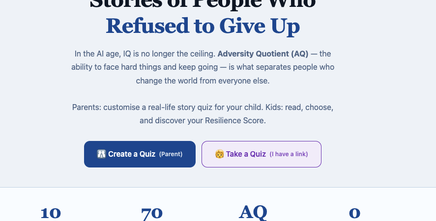
What AQ Kids is, in one paragraph
Parents choose 1-3 historical figures from a list of ten: Walt Disney, Marie Curie, Steve Jobs, Oprah, Nelson Mandela, Warren Buffett, Elon Musk, J.K. Rowling, Soichiro Honda, Stephen Hawking. For each person, they see the real decisions that person faced — bankruptcy, rejection, prison — and choose which image and which answer options to show their child. Then they write a short message for each score range. The child gets a link, reads the stories blind, makes the choices, and at the very end: their Resilience Score appears, followed by a personal message from their parent that they didn’t know was coming.
No login. No data saved on a server. Everything lives in the URL.
That “everything in the URL” part is what caused all three bugs I fixed today.
Three bugs. One root cause.
The bugs: the share link was enormous (sometimes over 2,500 characters), the QR code appeared as a white blank rectangle, and the child’s “Continue” button did nothing after answering a question.
I assumed they were three separate problems.
The share link was enormous because of how I was encoding the quiz configuration into the URL. The original method: btoa(encodeURIComponent(JSON.stringify(config))). What that means in practice: every quote character in the JSON became %22. Every colon became %3A. A configuration that was 1,200 characters of actual data expanded to 2,500+ characters of URL-encoded noise.
Fix: raw UTF-8 base64 encoding (no percent-encoding), plus compact key names (characterIds becomes c, decisions becomes d), plus skipping any messages that haven’t been changed from the defaults. URL went from 2,500 characters to under 280. About 90% shorter.
The QR code was blank because QR codes have a maximum data capacity. At 2,500 characters, the QR library was silently failing — generating nothing and displaying an empty white box. At 280 characters, it generated instantly and correctly. Same library, same settings. Just a shorter URL.
The Continue button was stuck in a loop. Every time the child clicked Continue, the screen scrolled back to show the character’s introduction again instead of loading the next question. The bug: the code was checking whether the number of answered questions matched the current question index to decide whether to show the intro screen — but after clicking Continue, that condition was still true. I added a Set to track which character introductions had already been shown. One fix. Three bugs resolved.
I tried to rebrand it. Then I changed it back.
Somewhere in the middle of today, I got feedback that “AQ Kids” sounded condescending for older teenagers. The suggestion: rename it to “AQ Sandbox” and call the quiz scenarios “Historical Decision Simulators.”
I spent an hour on it. Changed all the page titles, all the navigation labels, all the button text.
Then I looked at it for five minutes and changed it all back.
“AQ Sandbox” sounds like a developer’s test environment. “Historical Decision Simulators” sounds like something you’d read in a procurement document. “AQ Kids — Resilience Stories for Children” is plain, specific, and tells a parent exactly what they’re looking at within two seconds.
The feedback wasn’t entirely wrong, though. The child-facing page — the actual quiz that a teenager opens and reads — shouldn’t say “AQ Kids” in the navigation bar at the top. A fifteen-year-old reading about Mandela’s 27 years in prison doesn’t need to be reminded they’re using something called “kids.” So that one label changed. Everything else stayed.
The most important change that nobody will notice
Step 3 in the parent flow is where you write a message for your child. Before today, the label said: Write Your Message.
After today it says: Write a Letter to Your Child.
Below that: “When your child answers the last question, the screen goes quiet — then your words appear. They won’t know it’s coming. This is the moment that makes the quiz worth doing.”
This is the actual product. Not the historical stories, not the Resilience Score calculation, not the QR code. The product is a parent writing “I’m proud of you no matter what” into a text box, not knowing exactly when their child will read it or what score they’ll have gotten.
I should have written it that way from the beginning.
I added a tip button. First time ever.
Ko-fi link is now at the bottom of every quiz result screen: ko-fi.com/vantuanle43758
I’ve published 25 blog posts, built 11 historical simulators, a Chinese vocabulary flashcard tool, a 757-major university voting system, and now this quiz builder. None of them have ever had a payment button.
What surprised me wasn’t adding the button — it took five minutes. What surprised me was how much I rewrote the surrounding text before I was comfortable with it. “Support the creator” felt like I was asking for charity. “If you enjoyed this” felt passive. I ended up with something closer to: This tool took weeks to research and build. If it sparked a good conversation with your child, a small tip means a lot.
That’s not charity framing. It’s an honest exchange: here’s what this cost to make, here’s what I hope it gave you, here’s a way to acknowledge that if you want to.
Whether anyone taps it — I genuinely don’t know. But it’s there. For the first time, something I built has a voluntary price attached to it.
What shipped today
- URL encoding rewritten — share links are 90% shorter
- QR code now generates correctly (it was always just the URL length)
- Continue button no longer loops back to the introduction screen
- Reverted a one-hour rebrand to something that sounded worse
- Removed “AQ Kids” from the child-facing navigation bar
- Rewrote Step 3 to feel like what it actually is: a letter
- Added Ko-fi tip button — first time in five tools
- Added Google Analytics events: quiz_created, quiz_completed, kofi_clicked
- Added AQ Kids to the main tools page
- SEO pass: titles, descriptions, Open Graph tags, JSON-LD schema
The tool is live at ordinarymantrying.com/tools/aq-kids/
If you’re a parent and you try it, I’d genuinely like to know what you think — especially whether the letter framing in Step 3 lands the way I meant it to.
Share your experience or thoughts below.
Related Reading
I Built a Resilience Quiz for Kids Using Historical Decisions (AI Generated)
The tool explained: how AQ works, why historical decisions build resilience instinct, and how to run the quiz with your child.
Leave a Reply